
TikTok Advertisement Strategy Recommendation App
The advertisement strategy recommendation application is a tool for marketers that are unfamiliar with the most recent trends found on the short-form video application TikTok that are popular with younger target audiences. This tool will provide trends that are most relevant to the user’s business model, as well as comprehensive descriptions and examples of their implementations. The application also provides possible influencers that have subscribed to the network that would be most effective in the specific advertisement campaign.
This application will benefit marketers by assisting in increasing their audience in the age-group of young adults. The tool targets the main work practice of marketers: researching the most effective trends and how to implement them in line with specific business models. The application performs this work practice by taking their specific business preferences and supplying effective trends that can be implemented, as well as assisting in connecting with influencers. This solves the problem of lack of time in the work week and supplies supplemental room to improve the advertisement itself, decreasing stress for marketers, and providing a more flexible development process.
Timeline
Jan 2023 - April 2023
Programs Used
Figma
Micro
Team Members
Mayali Clary
Clara McDaniel
Jillian Ylagan
Namita Shashidhar
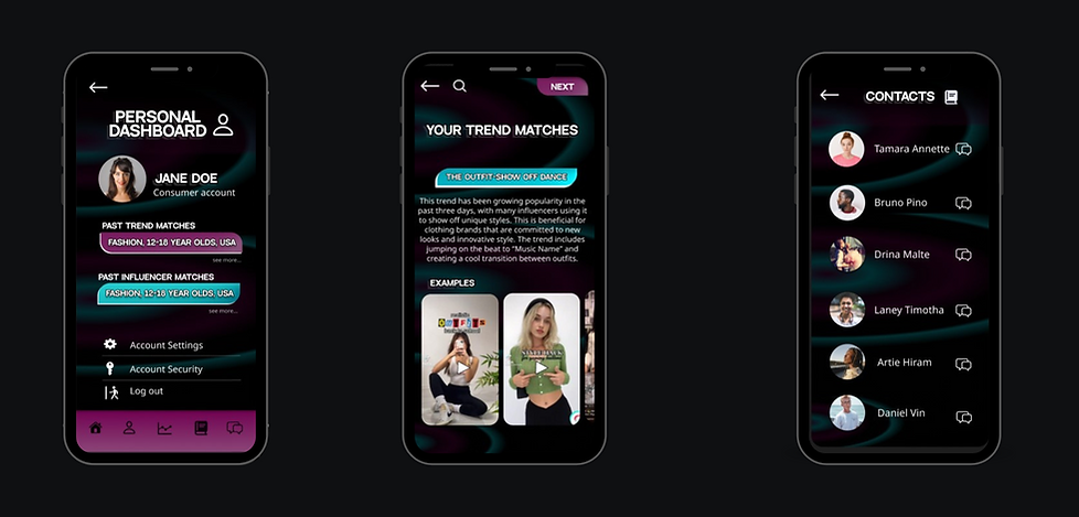

Task and mission
-
Match advertisers with trends and influencers that fit their target audience.
-
Provide advertisers with explanations and examples of new TikTok trends
-
Shorten advertisers research time
-
Bring business to influencers
Research Goals
-
How do advertisers on TikTok use the app?
-
What is the appeal of using TikTok?
-
How can we help increase advertisers' sales?
-
What do advertisers struggle the most with when using Tiktok?
-
What attracts users to buying products they see on TikTok?

Experience live interactions of this prototype here
Contextual Inquiry and Analysis
INTERVIEWS
Participants:
-
Forelife Golf Co Owner (Mickhal Clary)
-
Uses TikTok to market golf shoe company. Makes funny videos to advertise shoes.
-
-
Hollywood Reel (Jay Menez)
-
Uses TikTok as a way to create "teaser" videos for his upcoming shows.
-
-
Hardman Fishing Adventures (John Hardman)
-
Uses TikTok to show short clips of his YouTube videos to attract them to his channel.
-
-
WUVT (Micheal Haddad)
-
Creates short-form videos to attract viewers to the radio station's events.
-
-
TikTok User (Samantha Weatherly)
-
Is a colleged aged, everyday TikTok user in which our previous interviewees would be gearing advertisements towards on social media.
-
Notable Interviewee trends:
-
Each interviewee mentioned needing to make entertaining videos in order for products to sell.
-
TikTok is useful to small businesses as advertising costs are incredibly low- Tiktok's algorithm allows for anyone to be successful as long as their videos are deemed trendy.
-
Viewers are turned away from advertisements that feel too much like a commercial.
-
Viewers are willing to spend money on items that they think are trendy and don't feel pushed onto them.
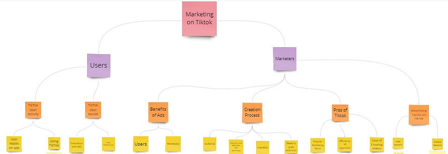
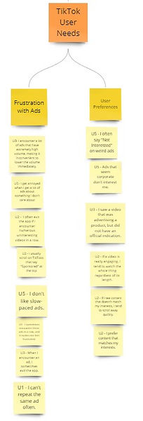
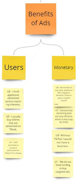
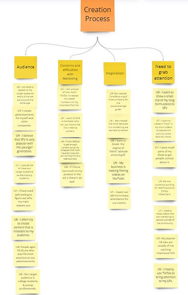
SYNTHESIZING WORK ACTIVITY NOTES
Better view WANs here



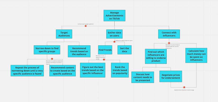
USAGE FLOW MODEL
Design Phase
PERSONAS
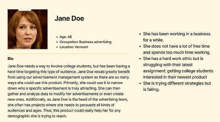
Jane Doe was picked as the main persona as she is the perfect candidate for someone who uses our advertising strategy recommendation app. Our app is meant for users who are unaware of current trends and need an explanation of how to make TikTok videos based around new trends, alongside examples. Additionally, the main audience our app would target would be busy advertisers who don’t know or understand TikTok very well, but want to reach college aged people in the most efficient way.
Ways our app would benefit Jane:
-
Spend less time on projects but cutting out research time
-
Gain insight on statistics of that videos receive the most views/likes on the app
-
Gain insight on new trends that appeal to college students
-
Explanation of trends that target older audiences who have never seen/heard of certain trends.
-
Way to interact with influencers who will help create videos
Ways Jane may struggle with our app:
-
May not understand how to go about video creation process on actual app after viewing trends for inspiration
-
Due to a budget, some influencers may not be usable as some may charge a higher premium for their service

Christina’s profile was created because she understands very little about TikTok trends. Additionally, she works in the marketing industry and is tasked with video creation to reach college students. Christina’s profile fits a subsect of targeted audience for our application as she has very little time to research trends, topics, and audio clips that are currently trending on TikTok and other social media.
How our application would benefit Christina:
-
Spend less time on projects by cutting out research time
-
Gain insight on statistics of videos that receive the most views/likes on the app
-
Gain insight on new trends that appeal to college students
-
Explanation of trends that target older audiences who have never seen/heard of certain trends.
-
Way to interact with influencers who will help create videos, become fashion ambassadors for her brand, etc.
-
Spend less time creating videos, as influencers are willing to create videos for her.
Ways Christina may struggle with our app:
-
May not understand how to go about video creation process on actual application after viewing trends for inspiration
-
Due to a budget, some influencers may not be usable as some may charge a higher premium for their service.
-
May struggle to find niche trends for specific fashion styles

Mark is a beneficial persona because he is a TikTok user. However, there are so many trends cycling around Tik Tok he is unsure of what kind of videos are the most popular; he also is unaware of different trends across different subsections or genres of videos. Additionally, he works in the marketing industry for which our app would be the most beneficial..
How our app would benefit Mark:
-
Spend less time on projects by cutting out research time
-
Gain insight on statistics of that videos receive the most views/likes on the app
-
Gain insight on specific genre’s trends and most viewed videos.
-
Gain insight on new trends that appeal to college students
-
Explanation of trends for someone who has never seen or heard of them.
-
Using the trend explanations, he can explain videos to his boss when presenting ideas
-
May refresh his memory on current trends he has already seen.
Ways Mark may struggle with our app:
-
He may find the “connect with an influencer” tab to not be useful for his situation
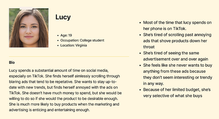
Lucy’s persona was created to represent the everyday user within the target age-range. She is the target audience for marketers using our application. She is a college student that spends a good amount of time online and likes the idea of seeing influencers that she enjoys recommending products, as she trusts their opinions. Additionally, she is a great target for marketers as she wants to be able to buy products she finds online and deems trending.
How our app would benefit Lucy:
-
Spend less time looking at advertisement videos that she does not enjoy
-
Feels like she isn’t watching commercials when she wants to decompress and enjoy herself on social media
-
Enjoying each video she comes across
Ways Lucy may indirectly struggle with our app:
-
She may dislike seeing influencers she likes posting too many advertisements
IDEATION AND CRITIQUE
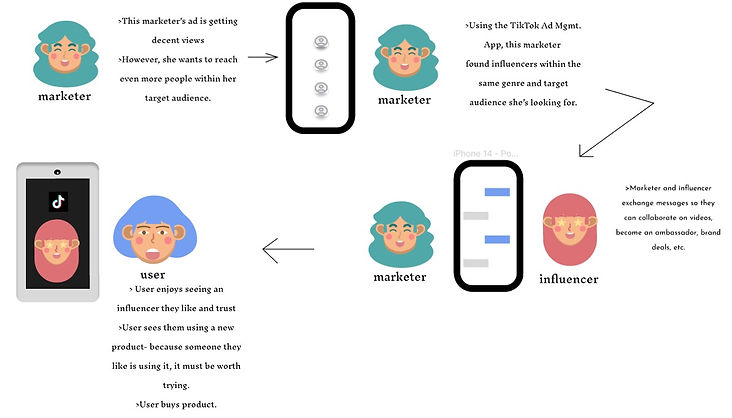
Idea: It would be great if there was a system that listed out possible influencers that marketers could look at to connect with the correct audience.

Idea: It would be good for college students to only see ads that they are interested in because then they would be able to efficiently buy products.

Final Idea: The advertisement strategy application gives an explanation on specific trends that are related to the product and target audience, allows for easy communication to influencers, and has a user interface that is easy to navigate through.
CONCEPTUAL DESIGN
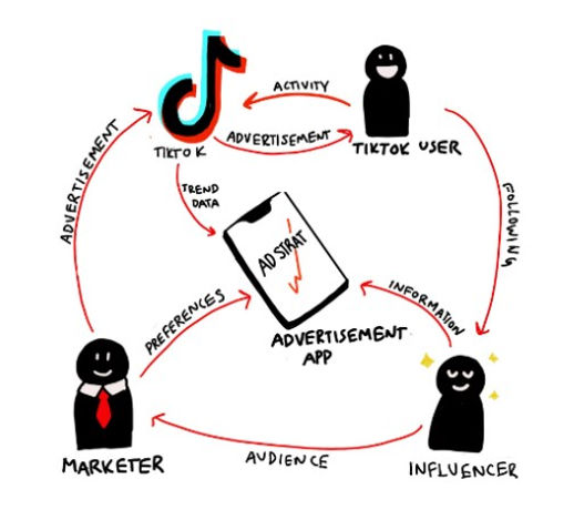
Ecological
The ecological sketch provided depicts a broad environmental view of the advertisement application in relationship with its surrounding stakeholders. This emphasizes a cyclical process between TikTok users, TikTok, the applications, and marketers and influencers. This high-level interaction displays the close relationship between these different work domains, and shows the important role that the advertisement application will play in acting as an effective connector between the marketer and the TikTok users they are targeting.
Emotional
The emotional concept sketch displays the main goal of the advertisement application, which is to make the job of marketers easier and less time consuming. The application provides an opportunity to avoid extensive research on recent trends, and allows marketers to focus more of their time on the quality of the advertisement and its aesthetic and social qualities. This will indirectly lead to a better relationship between the marketer and their work, resulting in better mental health and a work-life balance. The image depicts this distinction, the left-hand side showing a traditional process of building an advertisement, which involves extensive research and delay of projects being completed, a problem brought up by stakeholders in Phase 1 (see Appendix A). Meanwhile, on the right-hand side, the use of the application provides an opportunity to decrease the amount of work spent on this research and analysis, allowing the marketer to adopt a better work-outlook.

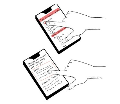
Interaction
The interaction concept sketch displays some snapshots of what the team believes will be the final design idea. The first depiction shows a user filtering their preferences for the trend they would want to implement, these trends relating to their product and business model. This provides a simple user-interface for the marketer to decide what they want to create, and the audience they want to reach. The second depiction is the page that would be displayed after this filtering of preferences, a list of trends that would be beneficial for the marketer to use, including descriptions and examples. The marketer in the image is choosing the trend at the top of the page, and will then bring them further into the application process.
STORYBOARDS


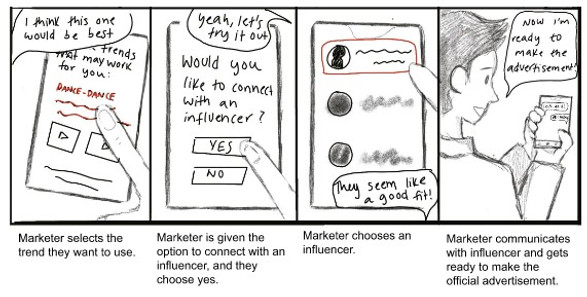
DEVELOPMENT OF WIREFRAMES
Experience live interactions of this prototype here

Wireframe #1
This was our original wireframe set. We aimed to create an app that was simplistic, user-friendly, and somewhat self-explanitory. However, our color scheme was lacking and design-wise lacking in creativity.
Wireframe #2
The updated wireframes from our original set, strived to be a bit more visually appealing and used picture association to guide users through the trend matching assessment.
Additionally, the color scheme was changed, but the aesthetic of the app did not appeal to many of our users.

Strengths
Weaknesses
-
US Strength 1:Spatial Organization:
-
The application is very user friendly and easy to use because of the simple design. For the initial survey, the user is taken through the questions one at a time on each page instead of having all of the questions on one page. That way, the user is not overwhelmed and their overall satisfaction increases. This assesses usability since the implementation of good spatial organization helps the user understand the mechanics of the application easily.
-
-
UF Strength 2: Connection Tool With Influencers
-
The conceptual design includes an opportunity to learn about, connect and communicate with influencers that would be most valuable to the user’s advertisement campaign. A simple chatting platform and recommendation system assists in this process, resulting in a useful networking tool. This assesses usefulness since connection with influencers is an important work task for marketers, and the networking tool on the application makes the fulfillment of this taks much faster and more efficient.
-
-
UF Strength 3: Fast Trend Research
-
The application includes a fast analysis of the user’s preferences and business characteristics, in turn providing a comprehensive list of relevant trends and their explanations. This is extremely useful, since it greatly cuts down on the time marketers usually spend on the process of market research, proving to be useful in necessary work tasks. This assesses usefulness since researching effective trends is an important work task for marketers, and the recommendation system on the application makes the fulfillment of this taks much faster and more efficient.
-
-
EI Strength 4: Simple Icons and Directional Buttons
-
In the application’s preference selection process, the icons representing different audience types and mechanics for selecting specific characteristics of the company are appealing to the user. This simple design, in addition to comprehensive directions for each step, allows for a relaxing experience for the user. This assesses emotional impact since the simple icons and directions allow for an easier and more relaxing experience.
-
-
US Strength 5: Menu Bar
-
The menu bar in the conceptual design serves as an efficient navigation tool for traveling throughout the different features of the application. The menu bar includes easy-to-understand icons, allowing the user to go to their desired location from any point in the application. This assesses usability since the opportunity to navigate through the app with ease accommodates any order of tasks the user wants to perform.
-
-
US Weakness 1: Responsive Design
-
The design needs to be accommodating towards different types of devices. For example, with certain iPhones, the top of the screen is not a perfect rectangle shape, and there is a divot at the top where the camera and microphone are. In the original design, some pages did not account for this aspect of the phone. So, our design needs to account for this and shift the content downwards so that it does not get cut off. This assesses usability since some sections of the application would be unavailable to users of certain iPhones, making it difficult to use the application correctly.
-
-
EI Weakness 2: Colors
-
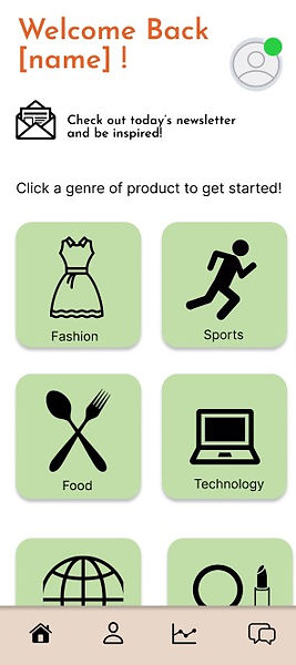
The colors throughout the design need to be more appealing to the eye. Initially, the conceptual design implemented green and orange. In order to make this design more aesthetically pleasing, future prototypes should include bolder colors, such as black, purple or blue. This assesses emotional impact since unaesthetic color choices will result in less positive emotions displayed while using the application.
-
-
UF Weakness 3: Amount of Data
-
In the original design, the data on the user;s advertisements were presented in one singular bar graph and an explanation. There should be more data included in the prototype to showcase a full, in-depth analysis of the trends and advertisements, as well as multiple options for how to display this data, such as pie charts or linear graphing. That way, the user can fully understand how to make their advertisement better. This assesses usefulness since the lack of needed data would prevent marketers from making the best decision in the future, while providing more data will allow them to fulfill their work tasks with the correct information on their previous advertisements.
-
-
UF Weakness 4: Influencer Information
-
Instead of just implementing a 5-star rating system that was used in the original design, the design should include more in-depth information about each influencer it recommends. This should include a brief summary of their content and personality, the statistics about their audience numbers and views,, examples of their most popular videos, and reviews from other marketers discussing their experience working with them. This assesses usefulness since the lack of sufficient information on the influencer would prevent the user from making an educated decision on which influencer they would work with.
-
-
EI Weakness 5: Confusing First-Time Use
-
The labels on the first prototype’s homescreen proved to be confusing for users with no prior experience. Initial labels included “Click an icon to Start!”, a vague directional statement that did not give definite indication of what the user is starting. This could result in frustration and annoyance. Instead, future prototypes should include more specific labels and explanations. This assesses emotional impact since the resulting frustration results in a negative emotional experience with the application.
-
Amended Prototype
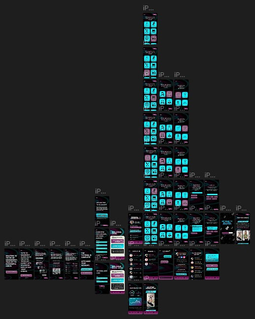

The initial color choices were a pastel orange and green. Users provided feedback on these colors by stating that the initial color set was not aesthetically appealing. The main color scheme of the application was changed to fit the color scheme of TikTok’s logo. Additionally, a pattern was created using these colors to create a creative backdrop for the app, while keeping the overall design simple.
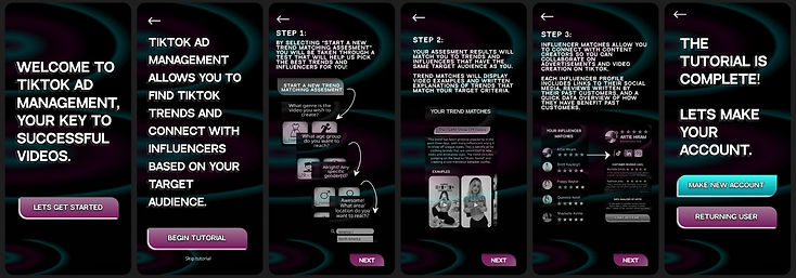

Our team added an introduction tutorial that leads first time users through a step by step process on how to use the app to make our app's intention more clear to first-time-users. From there the user may either make a new account or log back into an existing one to keep users from having to retake the assesment each time they open the app.

The home screen has been modified to quickly show users activity what they have missed since opening the app (or “logged on”), to entice them to read our weekly newsletter, and offer quick access to take the assessment test or to view past results. A criticism of the previous home page was that it opened directly to the first question of our assessment test; this user disliked having to retake the test every time they opened the app. In order to keep users from having to continuously retake an assessment, our team added in a requirement that follows our initial app tutorial in which users must make an account or login to an existing account so we can store their previous information more efficiently.
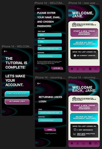

For easy access, a profile icon was added to the taskbar at the bottom of the screen, and the contacts icon was changed to a book; these design elements made association much simpler and easier to understand. Additionally, a large flaw in our original application was that we did not include a way for users to link their TikTok account for data collection. A feature added to the sign-up process fixed this issue; after making a login for our application, the user will then be able to login into their TikTok account through an external link so we may collect data information that will be used to create monthly logs and updates.
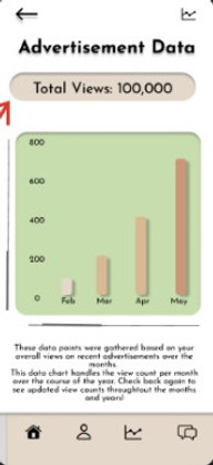
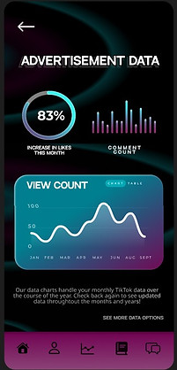
Our users wanted more ways to view their advertisement data. Additionally, many commented on that the original data page was not visually pleasing. Using the new color scheme, we created a data page in which users have access to a line graph, circle graph, and bar graph of their monthly data.
The influencer matching pages have been updated to show the highest rated influencers at the top of the search bar to the lowest rated influencer at the bottom. Once selecting an influencer page, a bio written by the influencer, past customer ratings, data analytics of how they have benefit past customers, and links to their profile will be shown so that users may pick the best fit influencer for themselves.

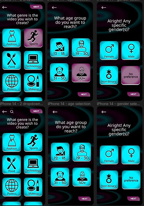

In the new amended prototype, button options change color when pressed so that users are made more aware of the option they picked before moving forward; this design aspect was added to guarantee that users pick the right option so that their match results will be accurate. Additionally, an interaction example of choosing a keyword in the search bar was added to this prototype.
